

Branding
JHub Apps reads its branding from c.JupyterHub.template_vars in
jupyterhub_config.py. The same dictionary drives two different renderers, so
it helps to know which one you are looking at:
- The React pages (home, create/edit app, server selection, admin app
table) fetch
/services/japps/config.jsonat startup and apply the returnedtheme.cssVariablesto<html>before the first render. The values you set override the Nebari design system tokens built into the UI through CSSvar()fallbacks. - The server-rendered JupyterHub pages (login, spawn form, token, admin,
OAuth) never load React. They link
/services/japps/theme.css, a stylesheet generated from the same theme, andhub.css, which consumes it.
Changing a value only needs a hub restart. No frontend rebuild is involved.
Defaults
Section titled “Defaults”themes.DEFAULT_THEME supplies the logo, favicon, font family and font URL
only. It deliberately sets no colours:
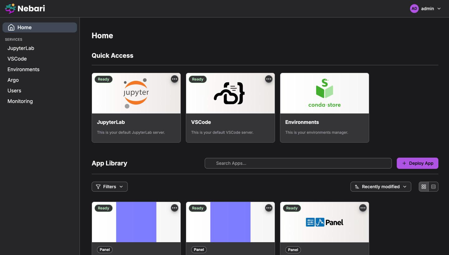
DEFAULT_THEME = { "logo": "/services/japps/static/img/Nebari-Logo-Horizontal-Lockup-Black-text.svg", "favicon": "/services/japps/static/favicon.ico", "font_family": "'Inter', sans-serif", "font_url": "https://fonts.googleapis.com/css2?family=Inter:wght@300;400;500;600;700&display=swap", "version": ...,}With no colour keys set, the React UI renders the Nebari design-system theme, which ships matching light and dark palettes. A colour you set replaces the corresponding token; everything else stays on the design-system defaults. This is why the defaults are empty: a single defaulted light colour would be forced onto dark mode as well.
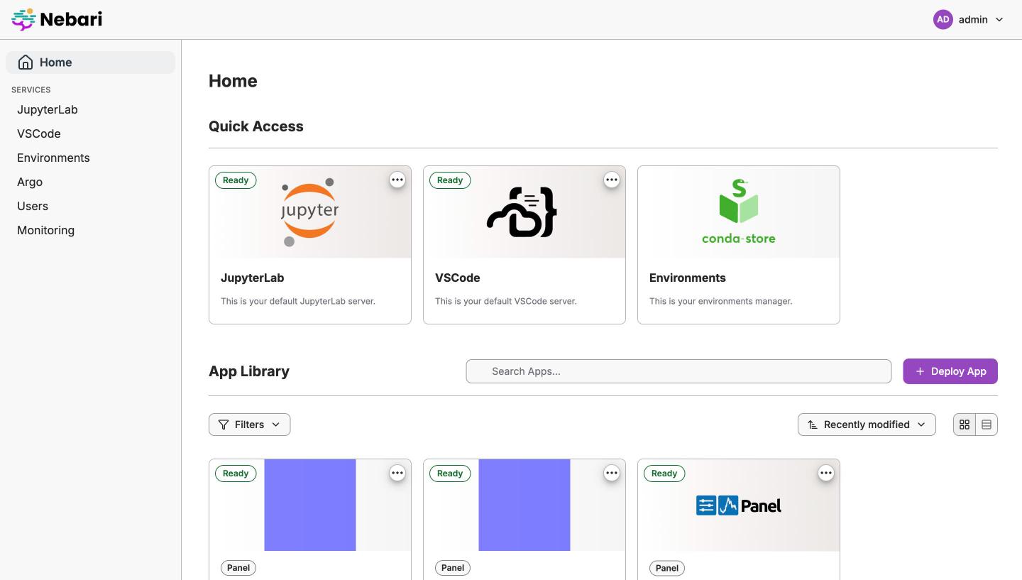
The server-rendered pages have no design-system tokens to fall back on, so
theme.css fills in themes.SERVER_PAGE_DEFAULT_COLORS underneath your values.
These are sRGB hex renderings of the light-mode Nebari tokens (primary
#9547c0, text #262628, navbar #f8f8f8, and so on). They are added to
theme.css only and never appear in config.json.
| Default theme, light | Default theme, dark |
|---|---|
 |
 |
Key reference
Section titled “Key reference”Every key is optional. The CSS variables column lists the custom properties
the backend emits for the key (THEME_CSS_VARIABLES in
jhub_apps/service/utils.py), which is what you would reference from any
custom CSS. The Mode column says whether the value applies in both colour
modes or only in light mode.
Assets and fonts
Section titled “Assets and fonts”| Key | CSS variables | React pages | Server-rendered pages | Mode |
|---|---|---|---|---|
logo |
– | Header logo. | Navbar logo. | Both, see Logo and dark mode. |
favicon |
– | <link rel="icon"> of the app shell. |
<link rel="icon">. |
Both |
font_family |
--app-font-family, --base-font-family, --headings-font-family |
Whole UI font stack. | Body and heading font. | Both |
font_url |
– | Injected as a <link rel="stylesheet"> before render. |
@import at the top of theme.css. |
Both |
logo and favicon are URLs. Anything the browser can reach works: a path
served by the hub (for example a file you add under
/services/japps/static/), an absolute URL, or a data: URI.
Brand colours
Section titled “Brand colours”| Key | CSS variables | React pages | Server-rendered pages | Mode |
|---|---|---|---|---|
primary_color |
--primary-color |
Primary buttons, focus rings, active sidebar item. | Primary buttons (.btn-primary, .btn-jupyter) and focus outlines. |
Both |
primary_color_dark |
--primary-color-dark |
Primary button hover. | Primary button and help-floater hover. | Both |
primary_color_light |
--primary-color-light, --primary-light |
Background of the active sidebar item. | Not used. | Both |
secondary_color |
--secondary-color |
Not used. | Secondary and success buttons. | Both |
secondary_color_dark |
--secondary-color-dark, --secondary-dark |
Not used. | Secondary and success button hover. | Both |
accent_color |
--accent-color, --link-hover-color |
Not used. | Login form header background. | Both |
accent_color_dark |
--accent-color-dark |
Not used. | Emitted but not consumed. | – |
accent_text_color |
--accent-text-color |
Not used. | Login form header text. | Both |
The “Both” rows for the server-rendered pages are nominal: those pages reuse
the brand colours unchanged in dark mode, so pick a primary_color that reads
on both a light and a dark surface. The React UI does the same, and pairs it
with the design system’s primary foreground: white text in light mode, black
text in dark mode.
Text and headings
Section titled “Text and headings”| Key | CSS variables | React pages | Server-rendered pages | Mode |
|---|---|---|---|---|
text_color |
--text-color, --link-text-color |
Body links. | Body text and links. | Light only |
h1_color |
--heading-color |
Not used. | h1 to h4. |
Light only |
h2_color |
--h2-color |
Not used. | h2. |
Light only |
Header
Section titled “Header”| Key | CSS variables | React pages | Server-rendered pages | Mode |
|---|---|---|---|---|
navbar_color |
--navbar-background-color |
Header background. | Navbar background. | Light only |
navbar_text_color |
--navbar-text-color |
Header text and icons. | Navbar links. | Light only |
navbar_hover_color |
--navbar-hover-color |
Hover and pressed surface of header actions. | Navbar link hover, open profile menu. | Light only |
Light and dark mode
Section titled “Light and dark mode”Users pick light, dark or system in the profile menu. The choice is stored in
localStorage under jhub-apps:color-mode, and the server-rendered pages read
the same key before paint so both renderers agree.
Operators configure a single palette, and most brand palettes are designed for a light surface. The keys therefore split into two groups:
- Applied in both modes:
primary_color,primary_color_dark,primary_color_light,secondary_color,secondary_color_dark,accent_color,accent_text_color,font_family,font_url,logo,favicon. - Applied in light mode only:
navbar_color,navbar_text_color,navbar_hover_color,text_color,h1_color,h2_color. In dark mode the UI keeps the design-system dark header and text colours, so a white branded header never ends up with white text on it.
Logo and dark mode
Section titled “Logo and dark mode”The default Nebari lockup ships in two files, one with black text and one with
white text. In dark mode both renderers swap the logo URL by replacing
Black-text with White-text in the filename, so the default logo is always
legible.
Custom logos follow the same rule, which gives you two options:
- Ship two variants. Name the light-mode file with
Black-textin it and put aWhite-textsibling next to it, for example/services/japps/static/img/acme-Black-text.svgand/services/japps/static/img/acme-White-text.svg. Setlogoto theBlack-textURL and dark mode picks up the other file. - Ship one file. If the URL does not change after the swap, dark mode
renders the logo as monochrome white (
brightness(0) invert(1)). A dark single-colour wordmark works well with this; a full-colour logo loses its colours in dark mode.
Complete example
Section titled “Complete example”from jhub_apps import themes
c.JupyterHub.template_vars = { **themes.DEFAULT_THEME, "logo": "/services/japps/static/img/my-logo.svg", "favicon": "/services/japps/static/img/my-favicon.ico", "font_family": "'Inter', sans-serif", "font_url": "https://fonts.googleapis.com/css2?family=Inter&display=swap", # Applied in both modes "primary_color": "#005EA2", "primary_color_light": "#005EA210", "primary_color_dark": "#1A4480", "secondary_color": "#2E8540", "secondary_color_dark": "#1F5A2C", "accent_color": "#FFBE2E", "accent_text_color": "#1B1B1B", # Applied in light mode only "text_color": "#2E2F33", "h1_color": "#1B1B1B", "h2_color": "#1B1B1B", "navbar_color": "#ffffff", "navbar_text_color": "#2E2F33", "navbar_hover_color": "#F0F0F0",}Spreading themes.DEFAULT_THEME first keeps the default logo, favicon and font
for any of those keys you do not override. It adds no colours, so the spread is
harmless if you set every key yourself.
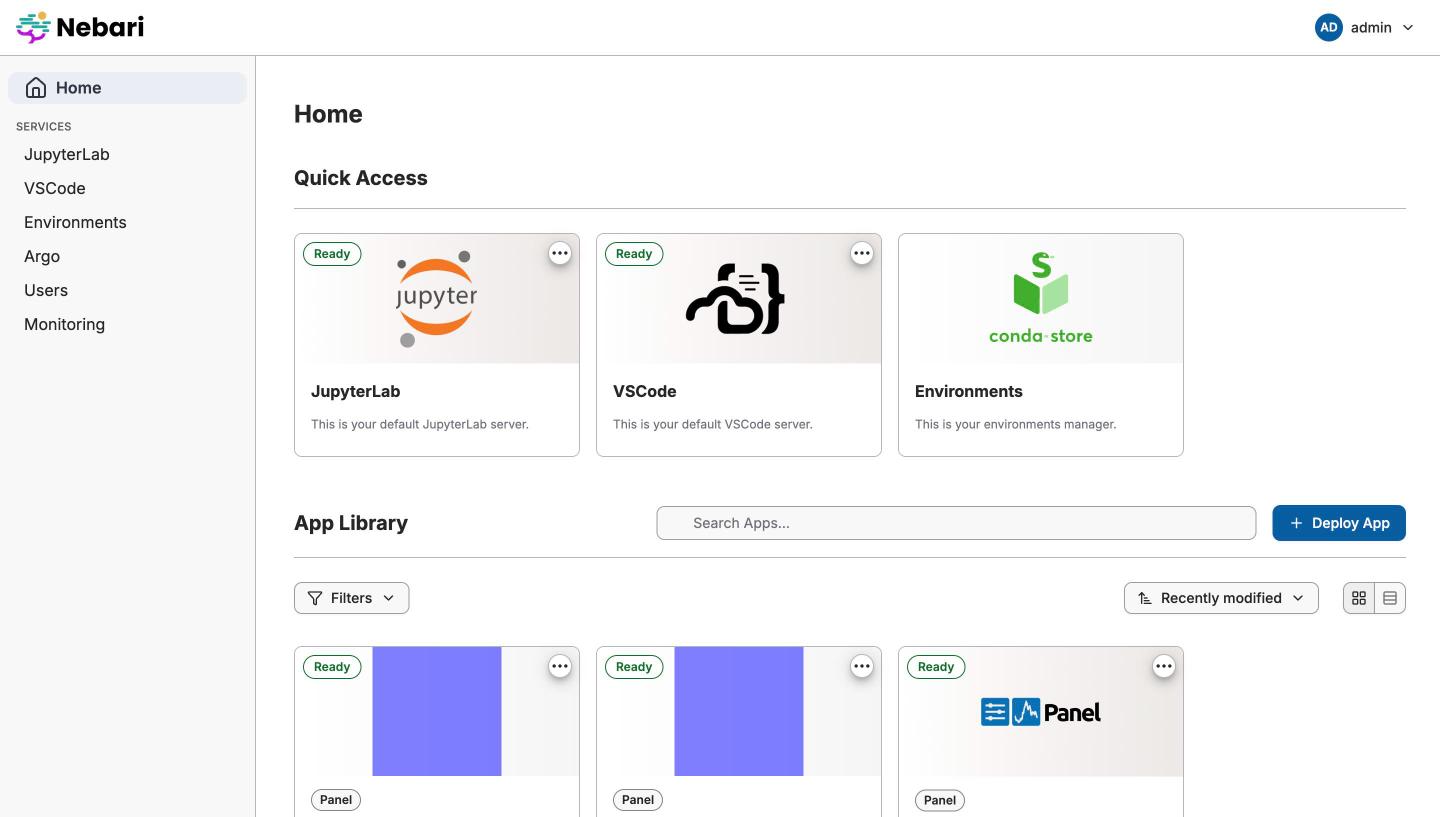
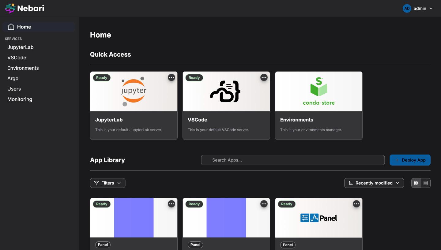
With primary_color: #005EA2, navbar_color: #ffffff and
navbar_text_color: #2E2F33 from the example, the home page looks like this.
The blue primary applies in both modes; the white header applies in light mode
only, and dark mode keeps the design-system header with the white-text logo:
| Branded, light | Branded, dark |
|---|---|
 |
 |
Helm deployments
Section titled “Helm deployments”When deploying with a Helm chart (Zero to JupyterHub or the Nebari data science
pack), set template_vars from your values through hub.extraConfig like any
other jupyterhub_config.py option:
hub:  extraConfig:    01-branding: |      from jhub_apps import themes
      c.JupyterHub.template_vars = {          **themes.DEFAULT_THEME,          "logo": "/services/japps/static/img/my-logo.svg",          "primary_color": "#005EA2",          "primary_color_dark": "#1A4480",      }
Verifying a deployment
Section titled “Verifying a deployment”# What the React pages apply: theme.cssVariables holds only the keys you setcurl -s https://hub.example.com/services/japps/config.json | jq .theme
# What the server-rendered pages load: your keys on top of the Nebari hex defaultscurl -s https://hub.example.com/services/japps/theme.cssIf a React page still shows the default colours, check that
config.json contains your variable, then confirm the key is one the React
pages consume in the key reference. Several keys only affect
the server-rendered pages.
Consistent branding across Nebari apps
Section titled “Consistent branding across Nebari apps”Other Nebari packs render the same design-system tokens from their own
configuration. To brand a whole platform, set the equivalent values in each
app. For the Nebi pack, which
takes camelCase token names under branding.theme.light and
branding.theme.dark, the mapping is:
JHub Apps template_vars key |
Nebi branding value |
|---|---|
logo |
logoUrl (light) and logoUrlDark (dark) |
favicon |
faviconUrl |
primary_color |
theme.light.primary and theme.dark.primary |
primary_color_dark |
theme.light.primaryHover and theme.dark.primaryHover |
navbar_color |
theme.light.header |
navbar_text_color |
theme.light.headerForeground |
navbar_hover_color |
theme.light.headerActionHover |
font_family |
Not configurable at runtime in Nebi. |
JHub Apps applies one primary_color to both modes, whereas Nebi takes a
separate dark value. Use the same colour in both places for light mode, and a
lighter tint of it for Nebi’s theme.dark.primary if the light value is too
dark to read on a dark surface.